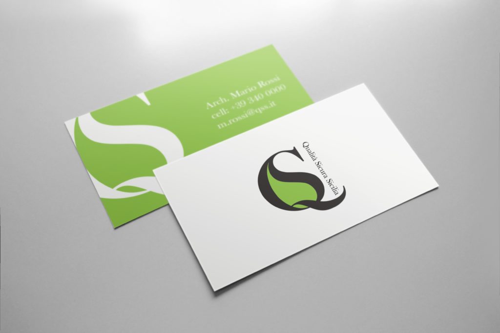
Creation of a simple brand, easy to read, with immediate identification of the sector to which it belongs. Strong and full traits that communicate effectively and expressively through the two initials QS and the geometric stylization of the leaf / fruit / drop. A sober logotype with a unique typeface but with hierarchical sizes: “QS” at the center as a first reading brand, in the foreground as the origin and founding matrix and the “leaf / fruit / drop” that can be referred to as products, but actually already unconsciously read as geometric shapes that can be easily understood without the need for analysis.
“The invisible Sicily” in the brand as “Mother Earth”, central in its origin and tradition.
Project: QUALITA’ SICURA SICILIA
Location: Sicily, IT
Team: Pacaram